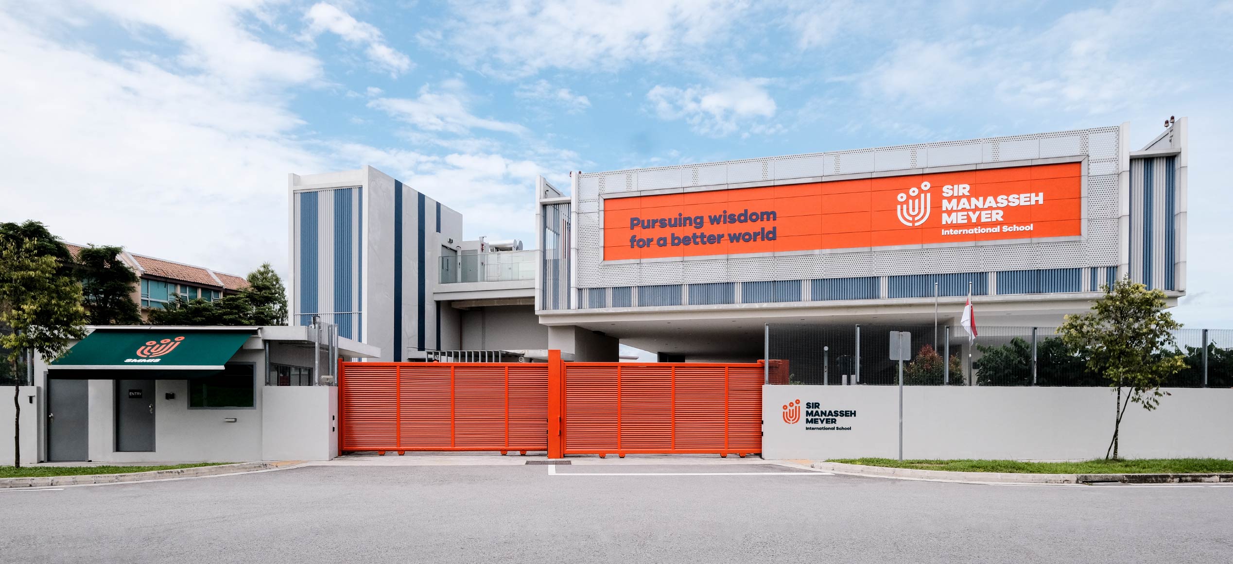
Pursuing wisdom for a better world
A new vision to unite parents and educators across faiths, cultures and ethnicities
A Singapore-based Jewish school faces the challenge of creating broader appeal with non-traditional Jewish and expatriate parents.
NOBLE VALUES OVER A NOBLE TITLE
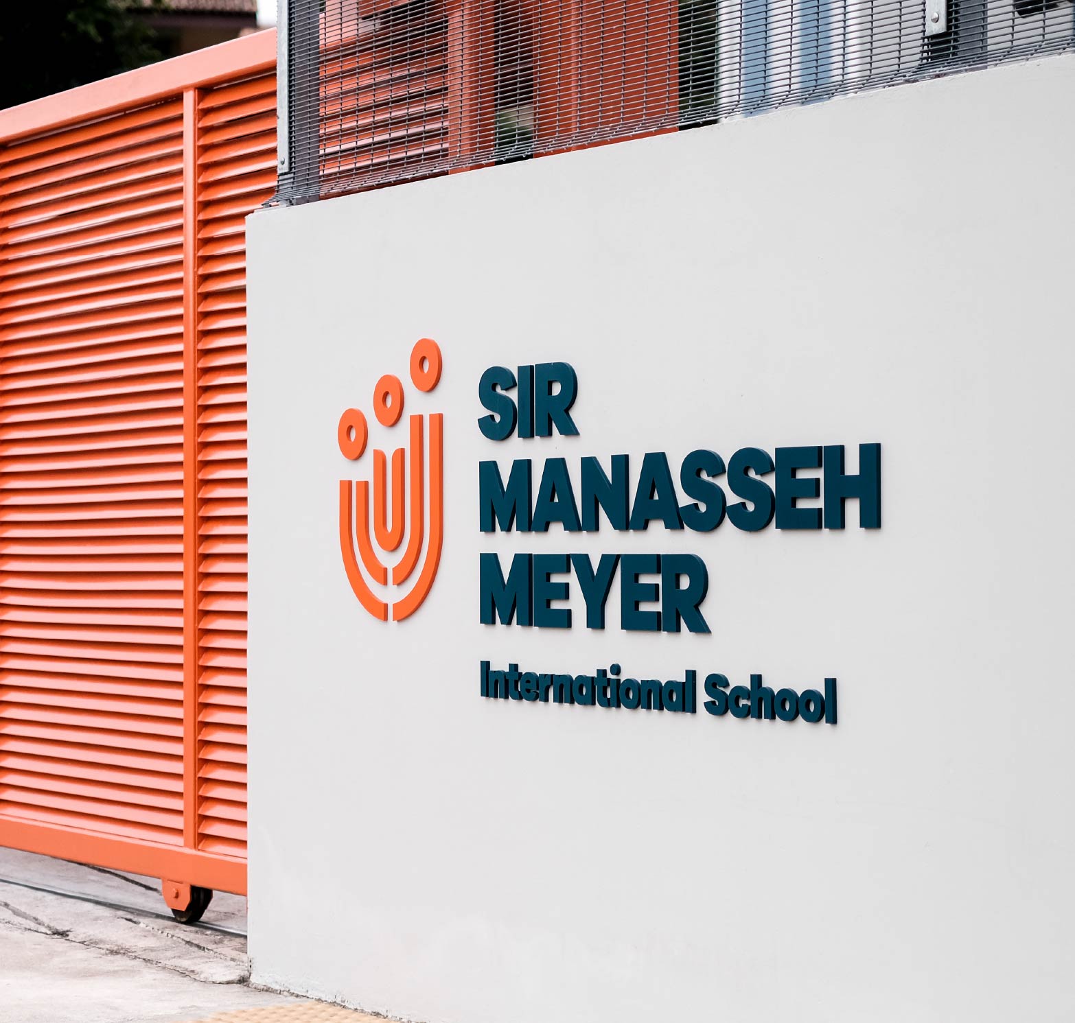
How do you rebrand an organisation when it involves a whole community’s cultural identity? This was the question &Larry faced when we decided to help Sir Manasseh Meyer International School (SMMIS), a not-for-profit school founded by Singapore’s Jewish community that was struggling to maintain its financial viability.


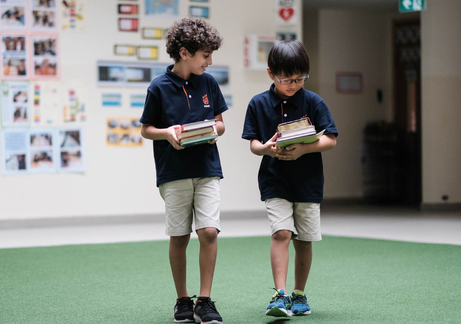

For a start, its previous branding had been built to leverage on the knighthood of Sir Manasseh Meyer, the namesake of the school, which was more commonly associated with chess than any noble qualities of the school itself. Having relocated to a more spacious location, SMMIS, faced the challenge of attracting sufficient enrollments from more liberal expatriate Jewish and non-Jewish families.
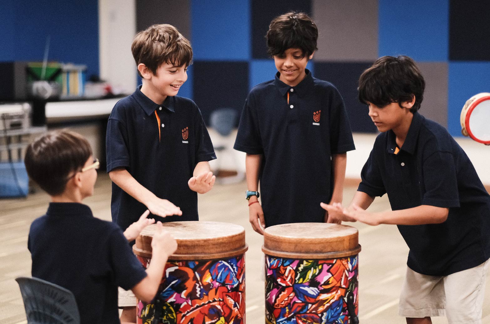
Working with Design Sojourn, we conducted a brand audit that involved teaching staff, the board of directors and also currently enrolled parents as well as those who chose to leave the school. We gained insights to the Jewish community in Singapore and its many differing perspectives, as well as the appeal of the school to non-Jewish parents. The result was a new brand strategy that included recommendations for the schools’ curriculum, brand communications and brand direction to improve community relations and brand appeal to expatriate parents.
The result was a new brand strategy that included recommendations for the schools’ curriculum, brand communications and brand direction to improve community relations and brand appeal to expatriate parents.
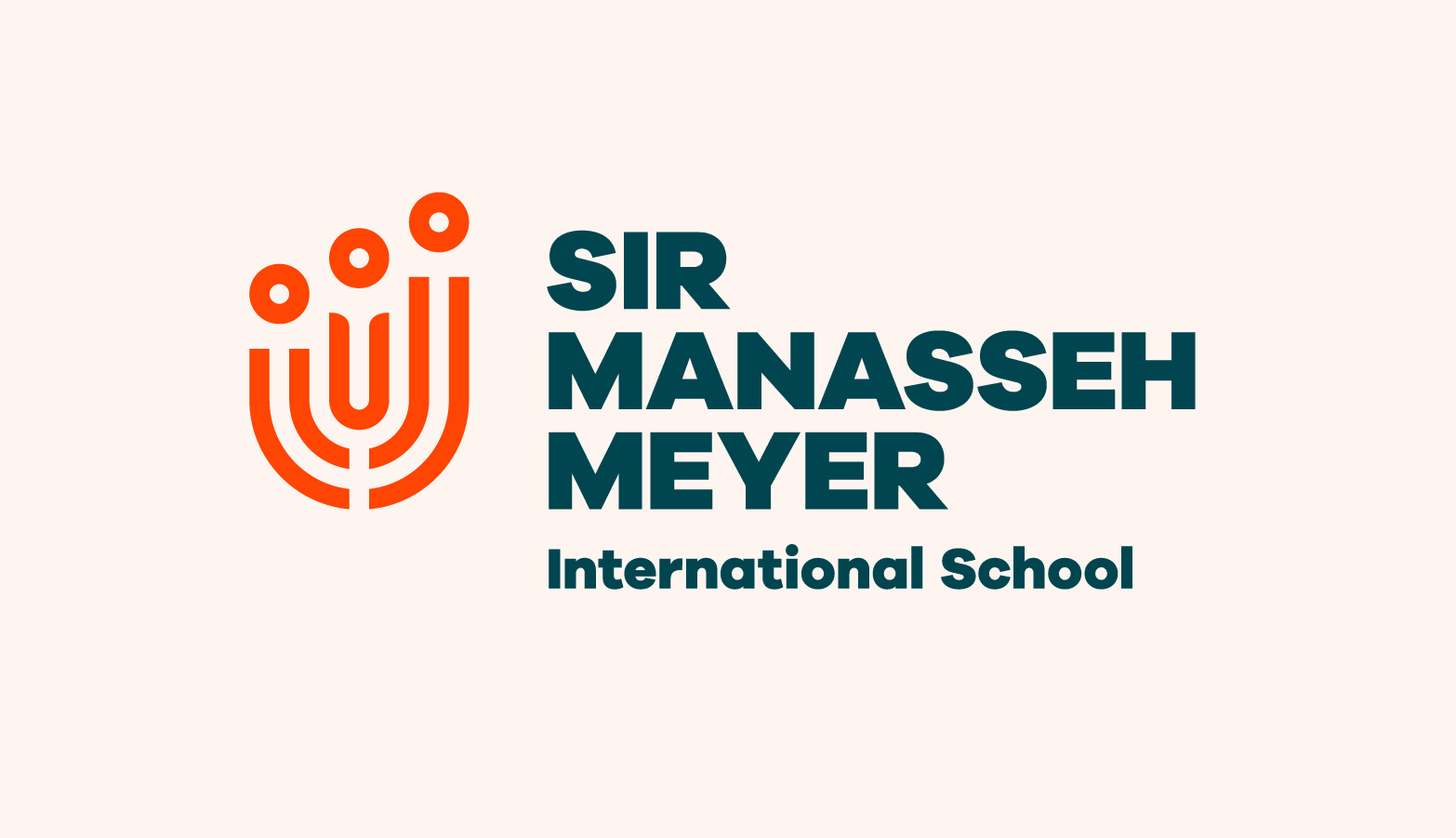
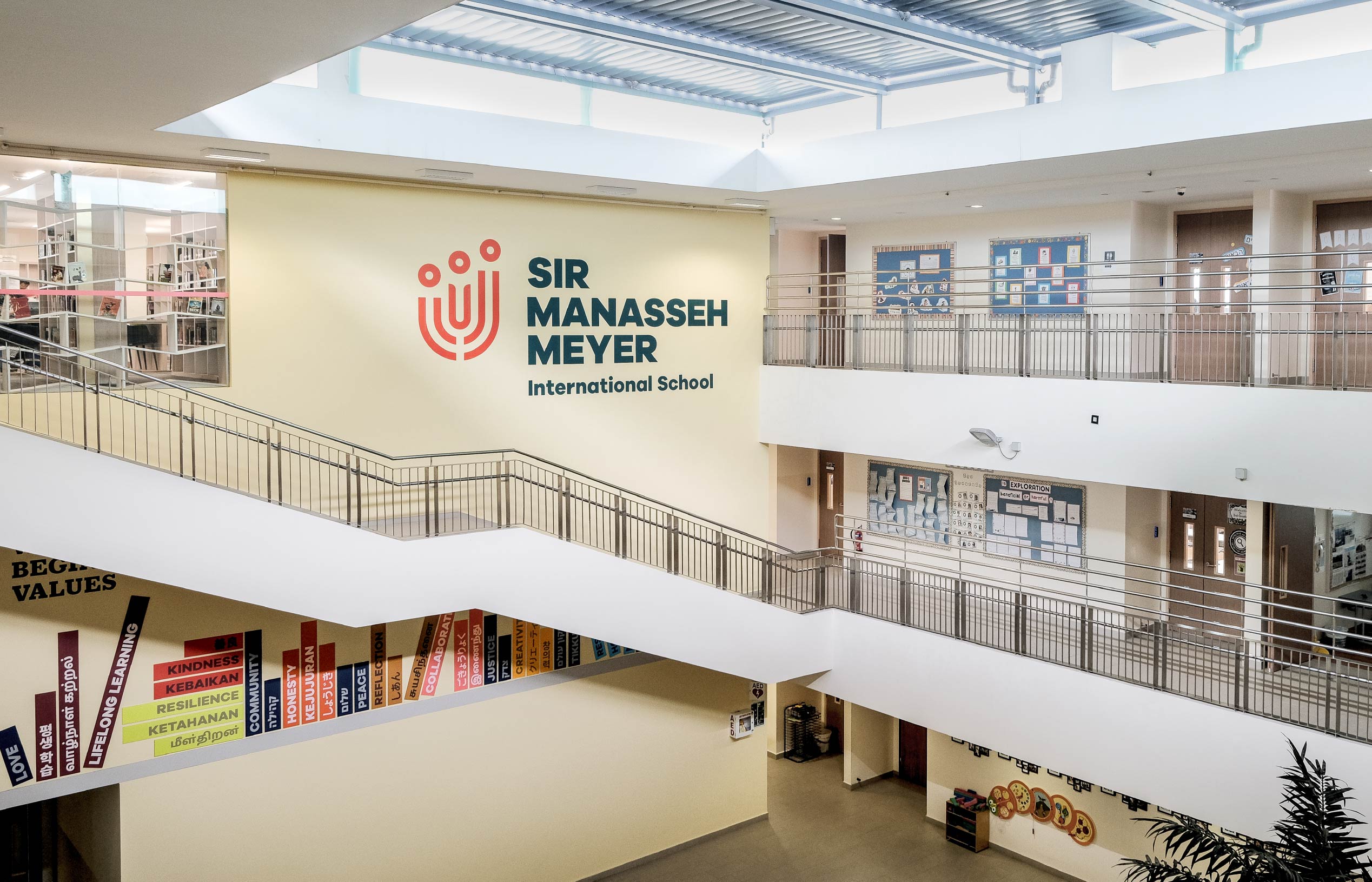
A new brand identity was designed to encapsulate SMMIS’s values and brand ethos: “Pursuing wisdom for a better world”, itself developed from ‘Tikkun Olam’, the Jewish concept of ‘Repairing the World’.
A LIGHT FOR FUTURE GENERATIONS
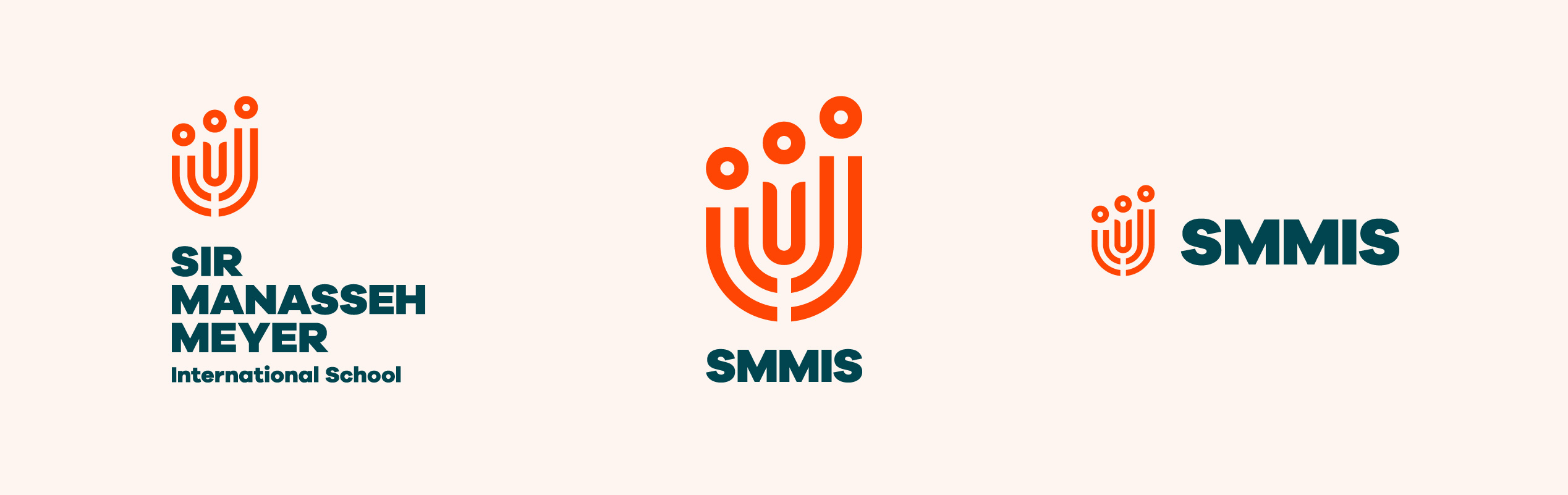
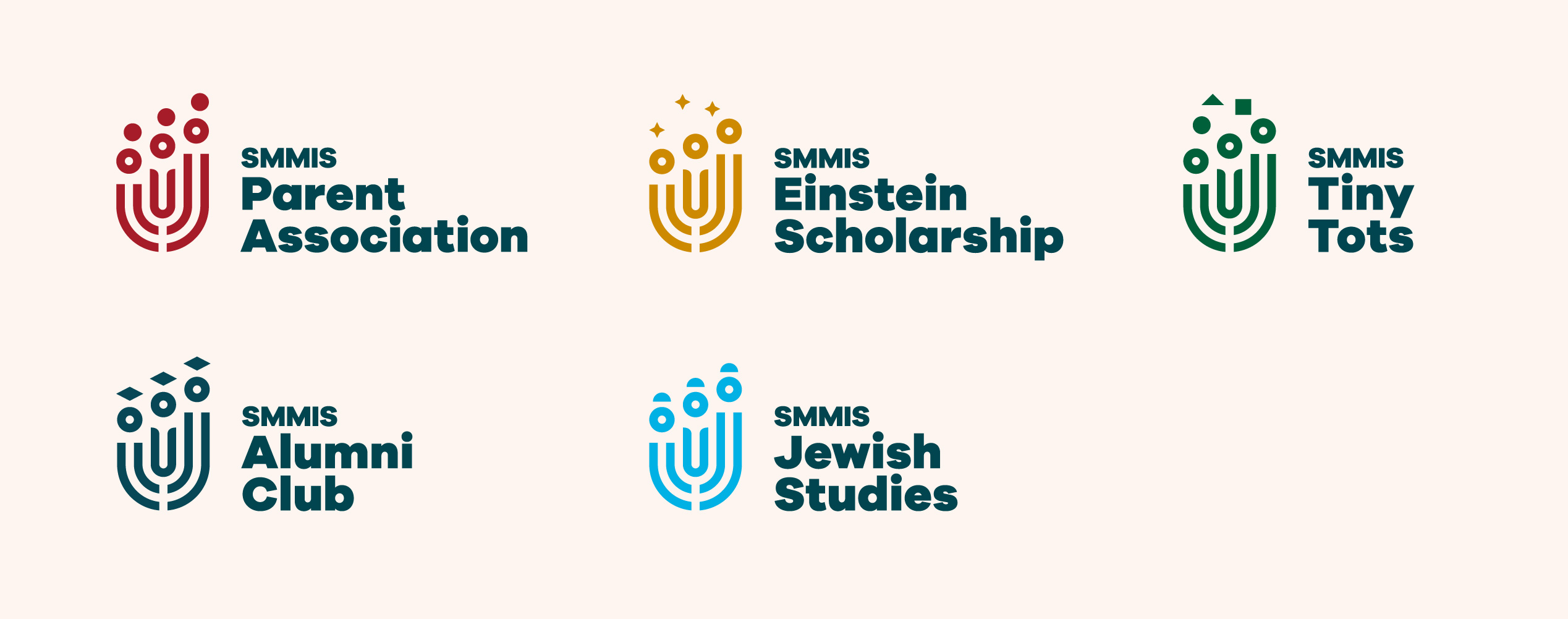
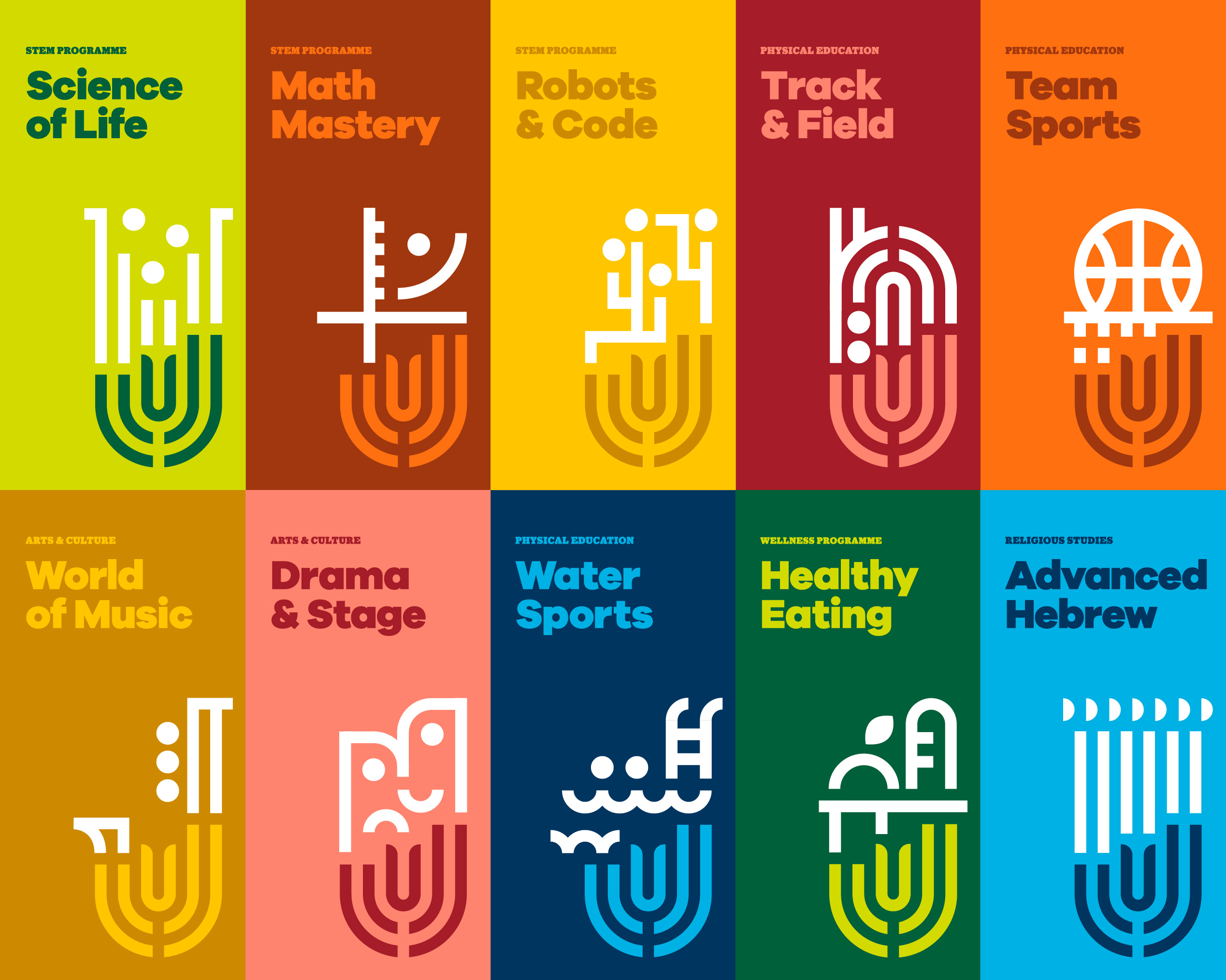
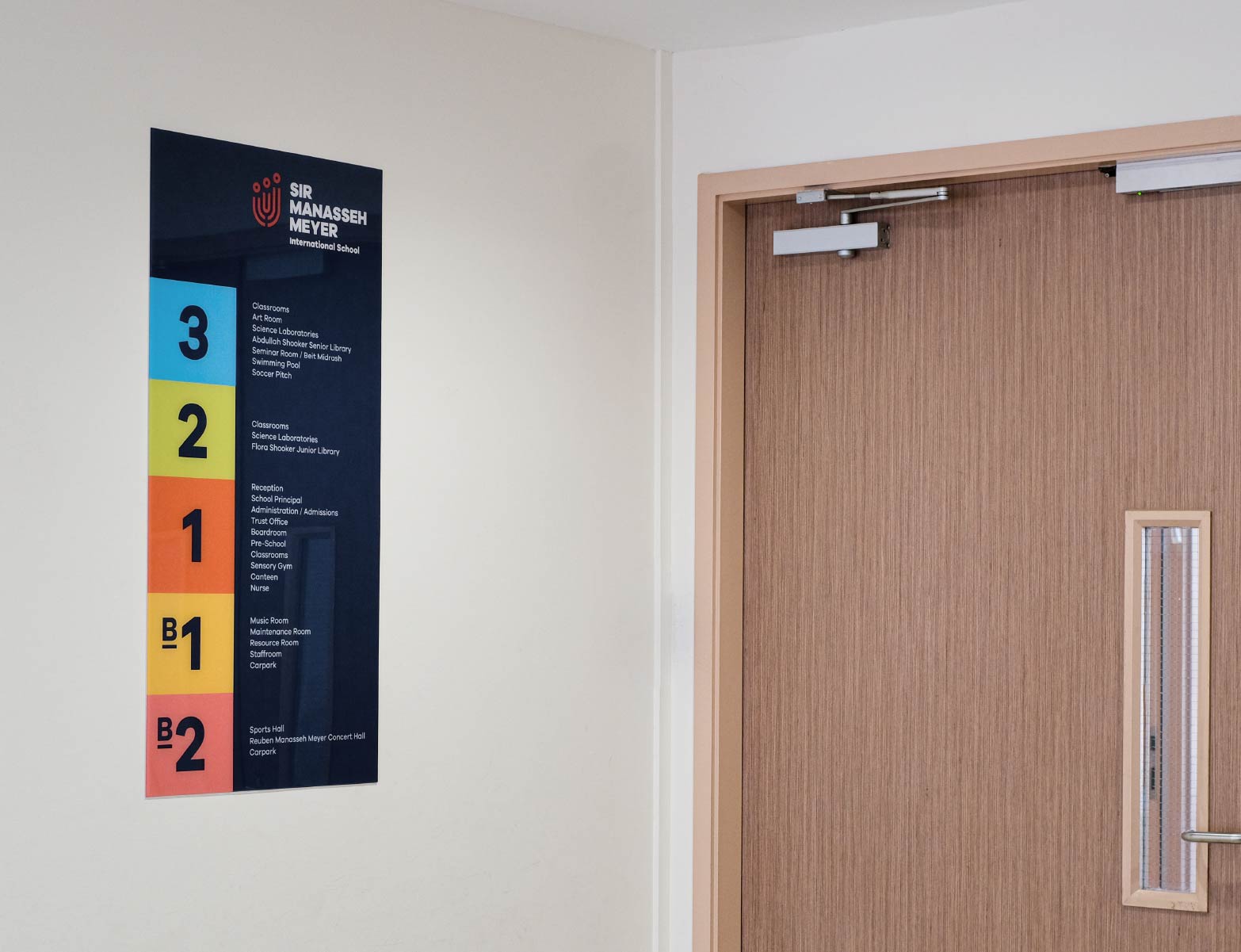
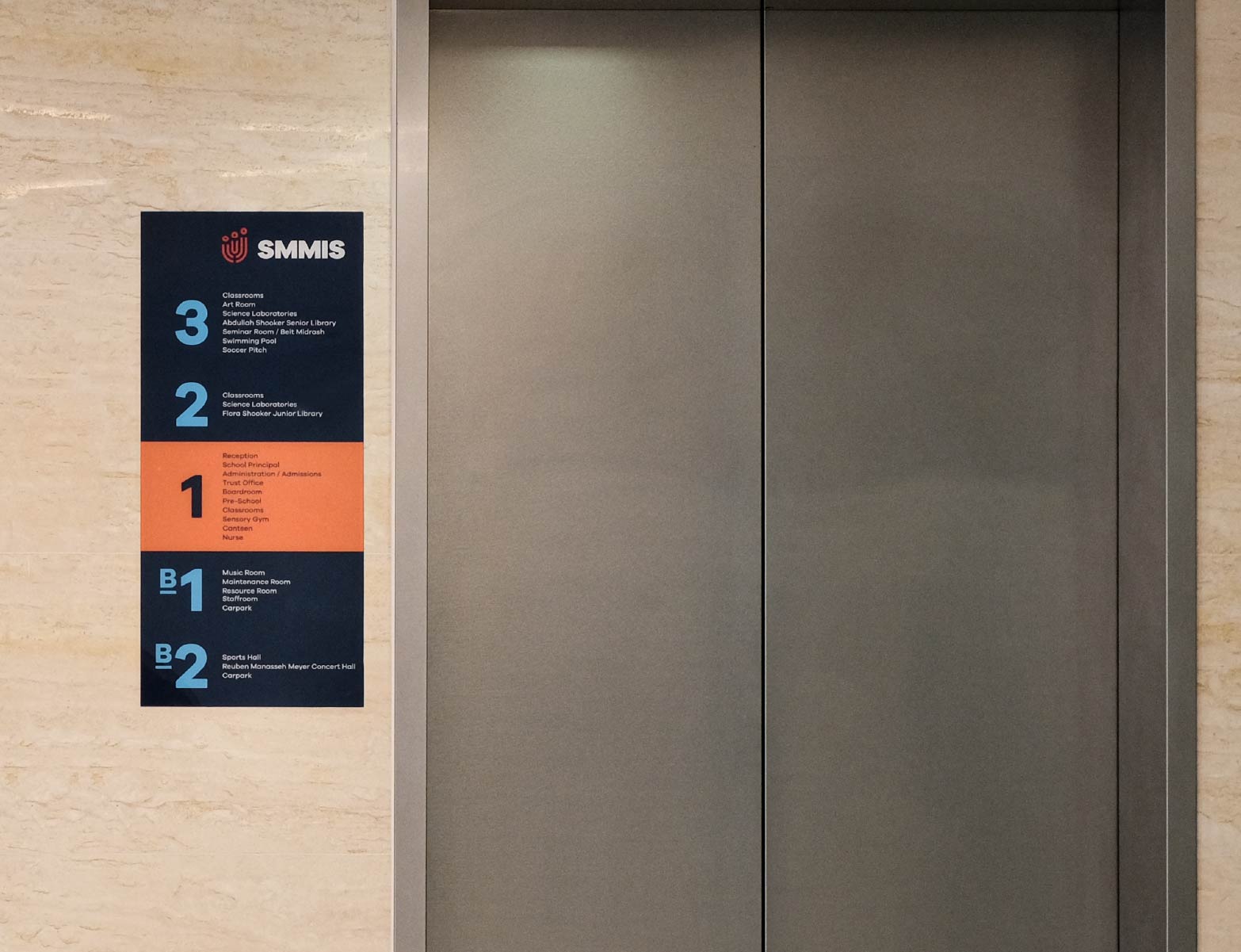
Our design of the new logo takes into consideration the need to preserve SMMIS’s Jewish identity while having broad appeal for an international school. The symbol itself is filled with meaning, incorporating elements such as the Jewish menorah, and symbols of universal values such as knowledge, growth, school-community support, and respect for a child’s individuality.
We appointed & Larry to work with us at a pivotal time as we were growing our name as an international school. They led us through a thorough and sensitive rebranding process that resulted in important insights that guided us as a school and as a brand. They fully grasped who we are, our values and our unique role in the world, and were able to incorporate these aspects into a beautiful, meaningful and timeless brand identity that is loved by our board, teachers and students alike. We found &Larry to be incredibly professional and met us with integrity, love and honesty. By the end of the process it felt like they were part of the SMMIS family.
Elaine Robinson
Principal, Sir Manasseh Meyer International School
2x
enrolment over 3 years
>50%
proportion of non-Jewish students
22%
growth in quarterly web traffic